11. Questions 11 through 21 are based on the following passage and supplementary material.
This passage is adapted from David Rotman, “How Technology Is Destroying Jobs.” ©2013 by M I T Technology Review.
M I T business scholars Erik Brynjolfsson and Andrew McAfee have argued that impressive advances in computer technology—from improved industrial robotics to automated translation services—are largely behind the sluggish employment growth of the last 10 to 15 years. Even more ominous for workers, they foresee dismal prospects for many types of jobs as these powerful new technologies are increasingly adopted not only in manufacturing, clerical, and retail work but in professions such as law, financial services, education, and medicine.
That robots, automation, and software can replace people might seem obvious to anyone who’s worked in automotive manufacturing or as a travel agent. But Brynjolfsson and McAfee’s claim is more troubling and controversial. They believe that rapid technological change has been destroying jobs faster than it is creating them, contributing to the stagnation of median income and the growth of inequality in the United States. And, they suspect, something similar is happening in other technologically advanced countries.
As evidence, Brynjolfsson and McAfee point to a chart that only an economist could love. In economics, productivity—the amount of economic value created for a given unit of input, such as an hour of labor—is a crucial indicator of growth and wealth creation. It is a measure of progress. On the chart Brynjolfsson likes to show, separate lines represent productivity and total employment in the United States. For years after World War Two, the two lines closely tracked each other, with increases in jobs corresponding to increases in productivity. The pattern is clear: as businesses generated more value from their workers, the country as a whole became richer, which fueled more economic activity and created even more jobs. Then, beginning in 2000, the lines diverge; productivity continues to rise robustly, but employment suddenly wilts. By 2011, a significant gap appears between the two lines, showing economic growth with no parallel increase in job creation. Brynjolfsson and McAfee call it the “great decoupling.” And Brynjolfsson says he is confident that technology is behind both the healthy growth in productivity and the weak growth in jobs.
It’s a startling assertion because it threatens the faith that many economists place in technological progress. Brynjolfsson and McAfee still believe that technology boosts productivity and makes societies wealthier, but they think that it can also have a dark side: technological progress is eliminating the need for many types of jobs and leaving the typical worker worse off than before. Brynjolfsson can point to a second chart indicating that median income is failing to rise even as the gross domestic product soars. “It’s the great paradox of our era,” he says. “Productivity is at record levels, innovation has never been faster, and yet at the same time, we have a falling median income and we have fewer jobs. People are falling behind because technology is advancing so fast and our skills and organizations aren’t keeping up.”
While technological changes can be painful for workers whose skills no longer match the needs of employers, Lawrence Katz, a Harvard economist, says that no historical pattern shows these shifts leading to a net decrease in jobs over an extended period. Katz has done extensive research on how technological advances have affected jobs over the last few centuries—describing, for example, how highly skilled artisans in the midnineteenth century were displaced by lowerskilled workers in factories. While it can take decades for workers to acquire the expertise needed for new types of employment, he says, “we never have run out of jobs. There is no longterm trend of eliminating work for people. Over the long term, employment rates are fairly stable. People have always been able to create new jobs. People come up with new things to do.”
Still, Katz doesn’t dismiss the notion that there is something different about today’s digital technologies—something that could affect an even broader range of work. The question, he says, is whether economic history will serve as a useful guide. Will the job disruptions caused by technology be temporary as the workforce adapts, or will we see a sciencefiction scenario in which automated processes and robots with superhuman skills take over a broad swath of human tasks? Though Katz expects the historical pattern to hold, it is “genuinely a question,” he says. “If technology disrupts enough, who knows what will happen?”
Note: The following two figures supplement this passage.
Figure 1
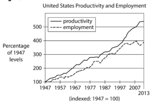
Begin skippable figure description.
Figure 1, which presents a graph of 2 lines, is titled “United States Productivity and Employment.” On the horizontal axis, the years 1947 through 2007, in increments of 10 years, are indicated, and the year 2013 is indicated at the end of that axis. Below the axis, a note reads “indexed: 1947 equals 100.” The vertical axis is labeled “Percentage of 1947 levels,” and the numbers 100 through 500, in increments of 100, are indicated. The key indicates that one line represents employment and the other line represents productivity. The line representing productivity is consistently above the line representing employment.
According to the graph, the approximate values for the line representing employment are as follows.
1947: 100 percent.
1957: 120 percent.
1967: 170 percent.
1977: 210 percent.
1987: 280 percent.
1997: 320 percent.
2007: 395 percent.
2013: 390 percent.
According to the graph, the approximate values for the line representing productivity are as follows.
1947: 100 percent.
1957: 150 percent.
1967: 210 percent.
1977: 280 percent.
1987: 310 percent.
1997: 380 percent.
2007: 500 percent.
2013: 550 percent.
End skippable figure description.
Figure 2
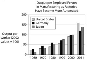
Begin skippable figure description.
Figure 2 presents a bar graph titled “Output per Employed Person in Manufacturing as Factories Have Become More Automated.” On the horizontal axis, the years 1960 through 2000, in increments of 10 years, are indicated, and the year 2011 is indicated at the end of that axis. The vertical axis is labeled “Output per worker (2002 values equal 100),” and the numbers 0 through 200, in increments of 50, are indicated. Three bars are associated with each year. The first bar represents the United States, the second bar represents Germany, and the third bar represents Japan.
According to the graph, the approximate values for the bars, from left to right, are as follows.
1960. United States, 25; Germany, 30; Japan, 15.
1970. United States, 40; Germany, 48; Japan, 41.
1980. United States, 46; Germany, 55; Japan, 51.
1990. United States, 52; Germany, 70; Japan, 75.
2000. United States, 90; Germany, 100; Japan, 100.
2011. United States, 160; Germany, 120; Japan, 140.
End skippable figure description.
Question 11.
The main purpose of the passage is to